“Helping set the day’s agenda … that was a journalistic high point.” Walter Cronkite
Google search queries reflect people’s interest. Journalistic reports reflect journalist’s interests and perhaps the journalist’s attempt to set the agenda (as the quote shows). One would expect that people’s interests and those of journalists would be similar when they report on news events, since journalists are (ostensibly) living among their fellow citizens. But is that the case? Come with me to a short journey and learn how journalists try (unsuccessfully) to set an agenda about the war in Gaza.
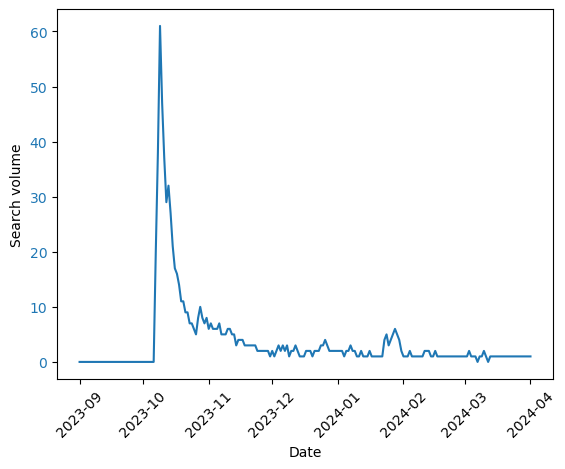
I downloaded data about the volume of search queries about the Gaza strip from Google Trends, between September 1st 2023 and March 31st, 2024. I did this for each country with 20 million or more people. I used the “Gaza strip” topic, so it deals with different languages but, of course, not with differences in access to the internet. One example of the queries over time is here, from Canada:
I then computed the similarity between the search volume over time between countries. You can see the result below. In this graph, countries that are joined towards the bottom are more similar to each other in the change of their queries over time.
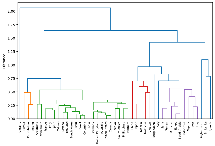
This graph (known as a dendrogram) shows some reasonable clusters: Muslim countries cluster in purple, and joining them is Turkey. France, Spain and Italy are together, as is the USA, Canada, UK, Australia, India and Germany. Perhaps we can use this to study similarities between countries? But I digress.
I then downloaded media interests, as computed by Google GDelt project. Similar to the Google Trends data, these provide the volume of media interests over time. The dendrogram for these data looks weird. There are fewer clusters that make sense. Egypt and Syria are together, but why Canada and Indonesia?
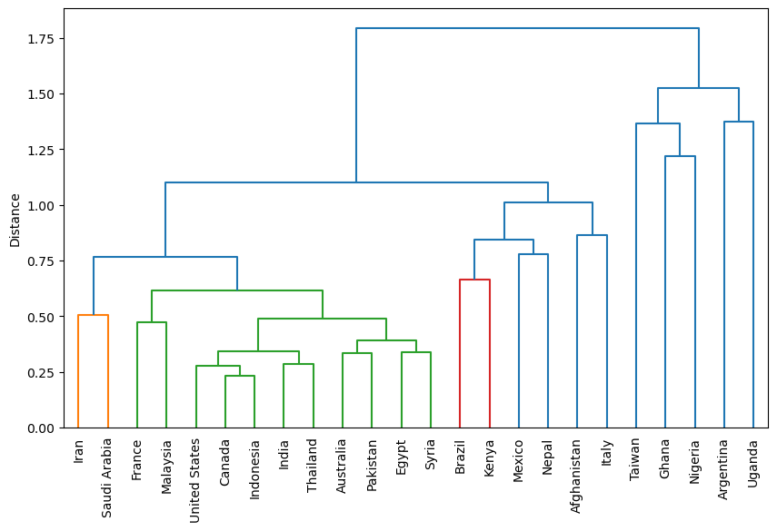
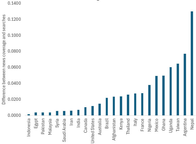
I think this is because the media is no longer representing people’s interests, nor is it driving them. To test this, I normalized the time series and ranked the countries by the square difference between the two time series: Media interests and query volume. Smaller differences mean that the two time series are more similar to each other. Here is the result:
And here are three examples of what these differences mean:
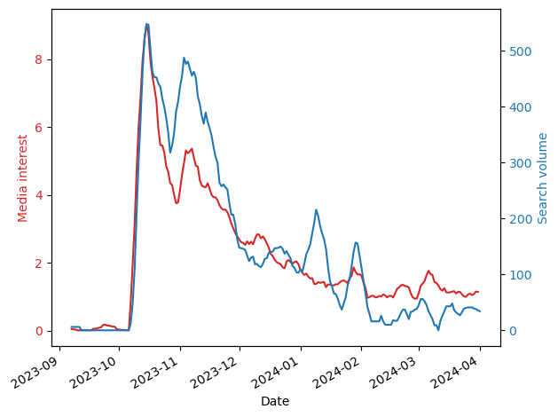
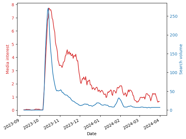
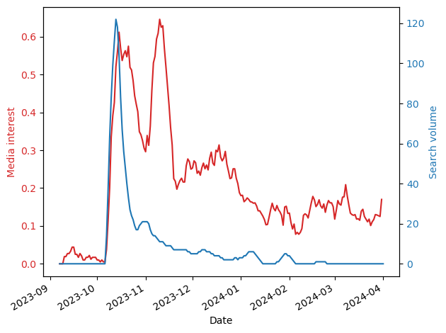
As you can see, in countries where the differences are small (e.g., Indonesia), there is a close correspondence between the two time series meaning that the volume of journalism is similar to that of people’s interests. However, in many countries journalists continue to report on Gaza, but people, by and large, are uninterested (e.g., France). This difference could be due to many reasons including, for example, news fatigue.
Personally, I think it might be related to journalist’s political leaning, which are not representative of society (see, for example, Do all sides deserve equal coverage? U.S. journalists and public differ). If this is true, I don’t think it’s a good thing, because people are getting only some of the story, eroding trust in journalism. It’s certainly true for this war, where reporting on Gaza is severely biased to Hamas’ point of view (e.g., casualty figures drawn from obviously biased sources).
