Search engines are the bread and butter of the internet. Over 90% of internet users turn to them during their activity online. Large Language Models (LLMs) are increasingly taking over the roles traditionally performed by search engines. Indeed, when giving talks to general audiences over the past couple of years people I increasingly often get asked, to what extent are LLMs replacing traditional search?
First, it’s worth noting that there is no clear division between LLMs and search engines, because search engines increasingly provide LLM outputs in their results. However, putting that aside, let’s try to estimate what the current status is.
One piece of evidence was provided by Apple’s senior vice president of services who said that there was a decline in the use of Google for the first time in 22 years. Where is that traffic going? Undoubtedly to LLMs.
A more quantitative answer might be gotten by looking at people’s searches (and yes, I do realize the irony of this idea). This is a reasonable tool because the volume of searches is a good proxy for a services’ popularity.
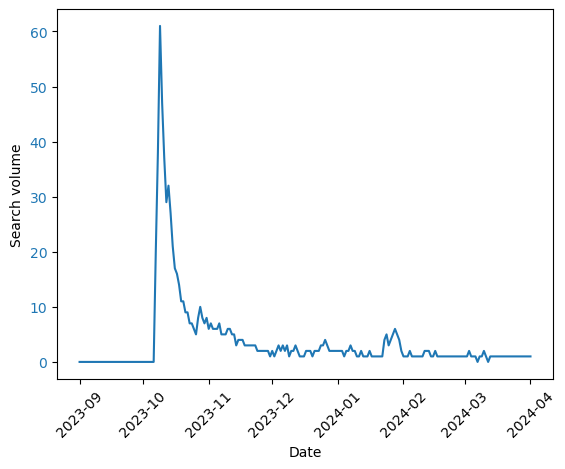
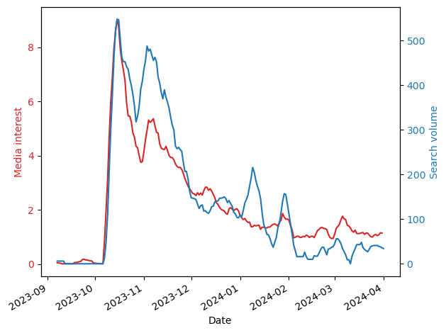
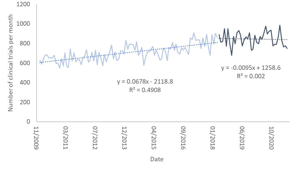
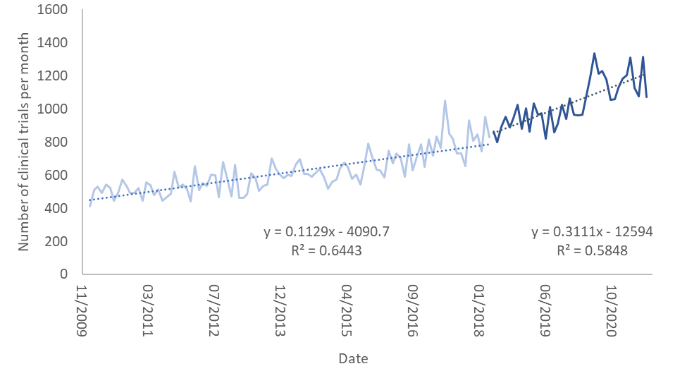
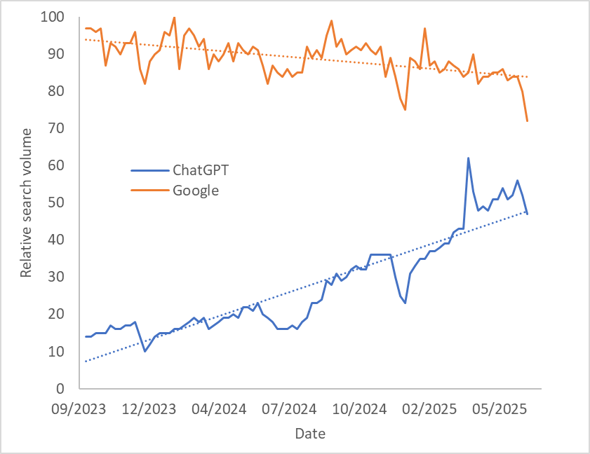
Using Google Trends, we can look at the (worldwide) search volume for Google versus that of ChatGPT (shown in the figure below). We find that Google’s search volume is slowly going down, while that of ChatGPT is increasing. I don’t think we can infer from this that ChatGPT will soon cross Google’s popularity (because Google is accessed in more ways than ChatGPT is), but this gives a feel for how things are changing.
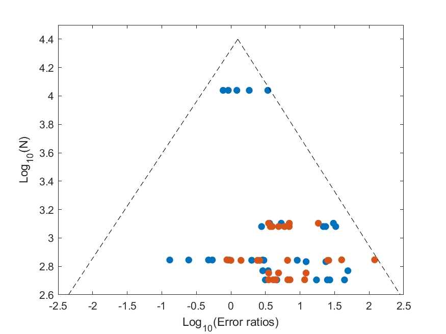
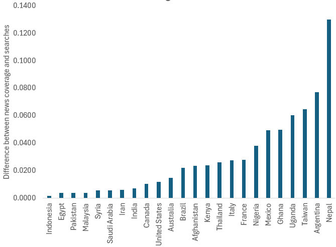
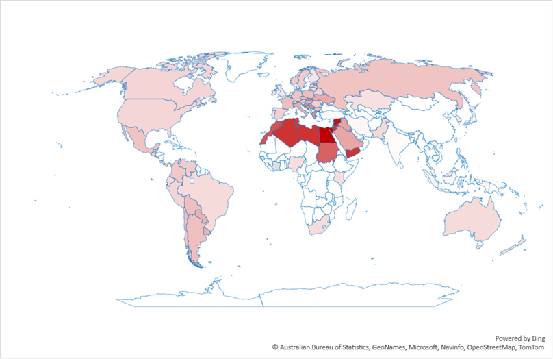
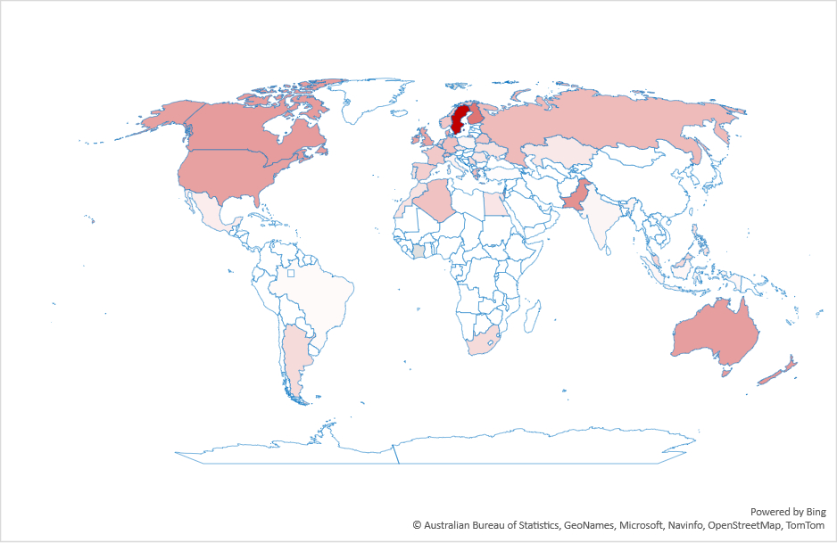
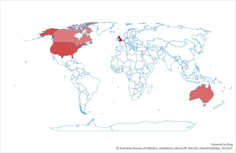
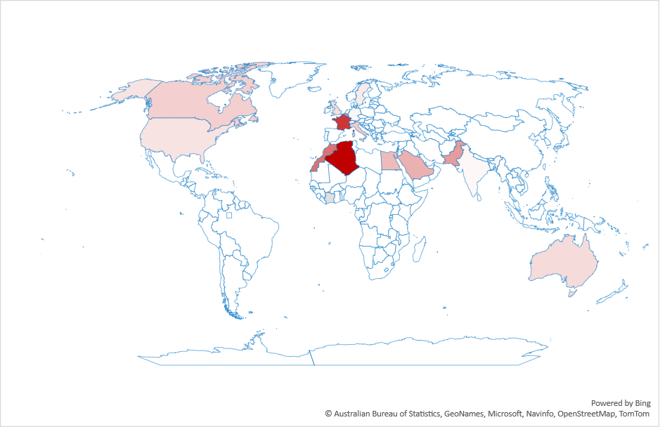
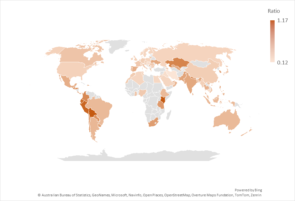
This switch to LLMs isn’t uniform across countries. Figure 2 shows the ratio of search volume for ChatGPT divided by the search volume for Google over the past year. As the figure shows, the most drastic changes are in Latin America and south Asia. Interestingly, what we’d consider “industrialized” countries are not the top countries in this graph.
Of course, ChatGPT isn’t the only LLM out there, but it’s the most well-known, which is why I looked at it. However, when I tried other LLMs I found significant regional variations depending on the LLM used. For example, according to Google Trends, DeepSeek is popular in China, and less so outside it.
Why should we care? I think there are a few reasons:
First, LLMs are starving the web for new content. LLMs need data to learn. If data on the web is increasingly LLM-generated, then LLMs are learning from themselves, leading potentially to a downward spiral of quality. But this is probably true only if you assume LLMs provide lower quality or less novel results.
Second, there is a financial aspect. Websites rely on traffic for their revenue. If LLMs take most of the traffic, many other websites will suffer. This is already an issue with Google’s LLM results.
Finally, as a research community we have had a good run designing, running and studying search engines. Have we reached the end of that road?